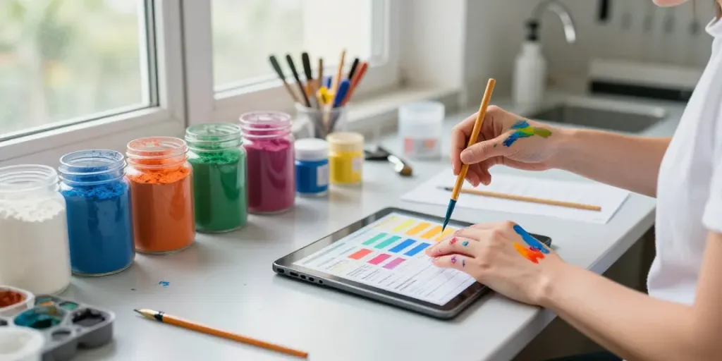
The Science of Color: Understanding HueAlchemy
HueAlchemy is a revolutionary approach to color mixing that dives deep into the nuances of how colors interact, blend, and transform. This method not only breaks down the complexities of color theory but also empowers artists, designers, and enthusiasts to recreate colors with precision and creativity. As we explore the spectrum of colors, we uncover their historical significance, chemical foundations, and practical applications. For those interested in mastering the art of color mixing, HueAlchemy provides comprehensive insights into this fascinating field.
What is HueAlchemy and Its Importance?
HueAlchemy represents a synergistic blend of art and science, where each color is not just a mere visual phenomenon but a compound of stories, traditions, and chemical properties. Understanding this approach allows creators to not only see colors but to also appreciate their origins, transformations, and the stories they tell. Whether you are a professional artist or a DIY enthusiast, navigating through the world of hues with the precision offered by HueAlchemy elevates your creative projects.
Color Theory Basics: Primary, Secondary, and Tertiary Colors
At the heart of any color mixing endeavor lies a solid understanding of color theory. Colors can be categorized into three main types: primary, secondary, and tertiary.
- Primary Colors: These are the building blocks of all other colors and include red, blue, and yellow.
- Secondary Colors: Created by mixing two primary colors, they include green, orange, and purple.
- Tertiary Colors: These are formed by mixing a primary and a secondary color, providing a spectrum of hues that enrich our visual language.
Grasping these concepts is essential for anyone looking to experiment with color mixing, as it sets the foundation for creating an expansive palette.
The Chemistry Behind Pigments: How They Work
Color is not just a visual experience; it is grounded in chemistry. Pigments, which are compounds that reflect specific wavelengths of light, play a critical role in how we perceive color. Understanding the chemical structure of pigments can help artists and designers make informed choices about their materials.
Different pigments exhibit varied properties such as lightfastness, opacity, and tinting strength. Knowledge of these characteristics allows creators to select the right pigments for their desired effects and longevity of their work.
How to Mix Colors: Practical Techniques
Mixing colors effectively requires both skill and an understanding of practical techniques. Here are some essential approaches and tools to help you on your journey.
Essential Tools for Successful Color Mixing
To achieve the best results in color mixing, having the right tools is essential. Key items include:
- Palette: A flat surface to mix colors, which can be made from glass, wood, or plastic.
- Pigment Dispenser: Used for precise measurements of pigments.
- Brushes and Mixing Knives: Essential tools for blending colors in various mediums.
- Color Wheel: A valuable visual guide for understanding color relationships and interaction.
Investing in quality tools will save time and enhance the quality of your work.
Understanding Ratios: The Key to Perfect Shades
Every color combination requires careful consideration of ratios to achieve the desired shade. Ratios dictate how much of each pigment to use, significantly impacting the final result. For instance, a 1:1 ratio of blue to yellow will yield a green, while a 2:1 ratio will create a deeper shade of green.
Experimenting with these ratios can lead to unique color discoveries, making it a fundamental skill for any color mixer.
Common Mistakes and How to Avoid Them
Even experienced artists can encounter pitfalls in color mixing. Here are common mistakes to watch out for:
- Ignoring Color Theory: Straying from basic principles can lead to muddy or unappealing colors.
- Overmixing: Sometimes, too much mixing can dull a vibrant hue, so knowing when to stop is crucial.
- Improper Ratios: Misjudging the ratios can result in unexpected shades that may not fit the intended palette.
Awareness of these issues can help you refine your skills and achieve your desired outcomes.
Exploring Color Applications: From Art to Design
Color plays a pivotal role across multiple fields, from traditional art to modern design. Understanding its applications can unlock new levels of creativity and effectiveness in your work.
How to Use Colors in Different Mediums
Each medium—be it watercolor, oil, acrylic, or digital—interacts with color in unique ways. For instance, watercolors are transparent and layered, while oils can create rich, textured appearances. Familiarity with how different colors behave in various mediums empowers artists to choose their palette wisely.
Experimenting across mediums can also enhance your understanding of color depth and tone.
Pairing Colors for Visual Harmony
Creating aesthetically pleasing compositions requires knowledge of color harmony. Utilizing concepts such as complementary, analogous, and triadic color schemes can guide you in crafting balanced and engaging artwork.
- Complementary Colors: Colors opposite each other on the color wheel, such as blue and orange, create high contrast.
- Analogous Colors: Colors that are next to each other, like blue, blue-green, and green, create a serene and cohesive aesthetic.
- Triadic Colors: Utilizing three colors that are evenly spaced around the color wheel can yield vibrant and dynamic compositions.
These principles not only enhance your work visually but also convey emotional and conceptual intentions through color.
Color Psychology: The Effects of Color in Art and Design
Colors evoke emotions and communicate messages. Understanding color psychology can greatly enhance the impact of your artwork or design. For example:
- Red: Often associated with passion and energy, it's a color that demands attention.
- Blue: Conveys tranquility and trust, making it a popular choice in branding.
- Yellow: Represents happiness and optimism but can also be overwhelming in excess.
By strategically incorporating these principles, you can create more resonant and communicative pieces.
Color History: Discovering the Origins of Pigments
The history of color is as rich and varied as the colors themselves. Exploring this history not only enhances our appreciation of pigments but also informs modern practices in art and design.
Ancient Techniques: The Journey of Color Through Time
Color has captivated humanity for thousands of years. Ancient civilizations, such as the Egyptians and Mesopotamians, used natural materials like minerals and plants to create pigments. The trade of these pigments influenced art and culture across continents, with techniques being passed down through generations.
Understanding this history gives artists deeper insight into the significance of their materials and informs their creative decisions.
Modern Innovations in Pigment Creation
Today, the creation of pigments has evolved significantly, incorporating synthetic compounds and innovations that enhance performance and safety. Modern chemistry allows for the development of vibrant, stable colors that were previously unattainable.
These advancements enable artists and designers to push the boundaries of their work, incorporating colors that respond dynamically to light and environment.
Ethical Sourcing: The Importance in Color Production
As the art community becomes increasingly aware of ethical practices, the sourcing of pigments has come under scrutiny. Artists and designers must consider the environmental impact and sustainability of their materials. This shift not only fosters responsible practices but also contributes to a more sustainable future for the arts.
Being informed about where and how pigments are sourced can guide you towards making more conscientious choices in your projects.
Future Trends in Color Mixing and Design
As we look ahead, emerging trends in color mixing and design are beginning to take shape, influenced by cultural shifts, technological advancements, and ecological considerations.
Emerging Color Trends to Watch for in 2026
Forecasting color trends involves analyzing societal moods and technological innovations. For 2026, colors that reflect sustainability, wellness, and digital integration are expected to dominate:
- Nature-Inspired Hues: Greens and earth tones reflecting a reconnection with nature.
- Pastel Tones: Soft, muted colors resonating with calm and mindfulness.
- Vibrant Accents: Pops of bold colors used to energize spaces and designs.
Keeping an eye on these trends can inspire fresh perspectives in your work.
The Role of Technology in Color Creation
The evolution of technology has transformed how colors are created and perceived. From advanced software that allows designers to visualize colors in real-time to the use of AI in predicting color trends, technology plays a crucial role in modern color mixing practices.
Staying current with these advancements can provide a competitive edge and inspire innovative approaches in your artistic endeavors.
Advancements in Sustainable Pigment Use
As sustainability becomes increasingly central in art and design, advancements in eco-friendly pigments are on the rise. Innovations in bio-based pigments and non-toxic materials are paving the way for environmentally responsible art practices.
Embracing sustainable practices not only aligns with broader ecological goals but also appeals to a growing audience that values ethically produced art.
What is HueAlchemy?
At its core, HueAlchemy is an innovative platform that brings together the historical, chemical, and practical aspects of color mixing. By breaking down complex concepts into manageable insights, it empowers users to experiment with and understand color on a deeper level.
How to Choose the Right Color for My Project?
Choosing the right color involves understanding the emotional context of your project, the audience you intend to reach, and the medium in which you are working. Utilizing color theory and experimenting with different combinations can guide you toward optimal choices.
What are the Benefits of Learning Color Mixing?
Learning the art and science of color mixing enhances your creative toolkit, allowing for greater expression and the ability to manipulate color to fit your vision. It opens up new opportunities for experimentation and innovation in various artistic fields.
Do I Need Special Tools for Color Mixing?
While some basic tools can elevate your mixing experience, they need not be extravagant. Simple palettes, measuring tools, and quality pigments can suffice, depending on your artistic goals.
How Can I Apply These Techniques in My Artwork?
Applying color mixing techniques is about practice and experimentation. Start small by exploring color relationships, and gradually incorporate more complex mixing as you gain confidence. Don't hesitate to document your findings, which can serve as valuable references for future projects.